
Youtube
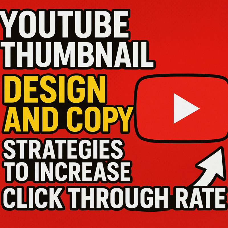
YouTube Thumbnail Design and Copy Strategies to Increase Click Through Rate
Sep
YouTube Thumbnail CTR: Design and Copy Strategies That Drive More Clicks
A YouTube thumbnail is more than a small image. It is a decision trigger. In a crowded feed, viewers scan dozens of videos in seconds, and the thumbnail often determines whether they pause, notice, and click. If your goal is to improve YouTube thumbnail CTR, the design and copy must work together with clarity, contrast, and curiosity.
This guide explains the most effective thumbnail design principles and thumbnail text strategies for boosting click-through rate without relying on clutter, gimmicks, or misleading tactics.
Why YouTube Thumbnail CTR Matters
Click-through rate, or CTR, measures how often viewers click your video after seeing it. A strong thumbnail can significantly improve this metric because it affects first impressions before the title or description even matters.
High-performing thumbnails usually do three things:
- communicate the topic instantly
- create visual separation from competing videos
- encourage curiosity without confusion
In competitive niches, thumbnail optimization is one of the most important parts of YouTube SEO and audience growth.
1. Keep the Design Simple and Focused
The best thumbnails are easy to understand at a glance. Too many elements create visual noise and reduce clickability.
What to include
- one clear subject
- one focal point
- limited text
- strong color contrast
- bold facial expression or product emphasis when relevant
What to avoid
- too many objects
- small unreadable text
- overly detailed backgrounds
- conflicting visual messages
- excessive branding that dominates the image
A thumbnail should communicate one idea only. If the viewer has to decode it, the opportunity is lost.
2. Use High Contrast to Stand Out
YouTube is a visual marketplace. Thumbnails compete side by side, so contrast is essential.
Effective contrast tactics
- light text on dark backgrounds
- dark text on bright backgrounds
- complementary colors that pop together
- separating the subject from the background with shadows or outlines
High contrast improves readability on mobile devices, where most YouTube traffic now comes from. A thumbnail that looks good on desktop but fails on a phone is not optimized.
3. Make the Subject Instantly Recognizable
Recognition is a major CTR driver. Viewers are more likely to click when they immediately understand what they are seeing.
Strong thumbnail subjects include
- a face with a clear emotion
- a product or tool shown close up
- a before-and-after comparison
- a result or transformation
- a visual representation of the video’s core promise
Human faces often perform well because they create emotional connection. If you use a face, make sure the expression feels natural and matches the video’s tone.
4. Use Text as a Reinforcement Tool, Not the Main Message
Thumbnail copy should support the image, not repeat the title word for word. The goal is to add clarity or curiosity in just a few words.
Best practices for thumbnail text
- keep it to 2 to 5 words
- use large, bold fonts
- choose legible typefaces
- place text where it does not block the focal point
- make every word count
Good thumbnail text examples
- “Big Mistake”
- “Before vs After”
- “What Changed?”
- “Unexpected Result”
- “Do This Instead”
These phrases work because they are short, emotionally clear, and easy to process quickly.
5. Create Curiosity Without Being Misleading
Curiosity is powerful, but false promises damage trust and can reduce long-term performance. The most effective thumbnails raise a question the viewer wants answered.
Curiosity-driven approaches
- show part of the outcome, not the entire outcome
- hint at a problem and its solution
- reveal tension, contrast, or surprise
- use incomplete visual information in a way that still feels honest
A strong thumbnail should make people think, “I need to know what happens next.” It should not make them feel tricked.
6. Use Emotion to Improve Engagement
Emotion increases attention. Thumbnails with clear emotional signals often outperform neutral visuals.
Emotions that work well
- surprise
- excitement
- concern
- frustration
- confidence
- relief
The key is consistency. If the thumbnail shows urgency but the video is calm and instructional, the mismatch can hurt performance. The visual tone should align with the content.
7. Design for Mobile First
Most YouTube thumbnails are viewed on smartphones, so mobile usability should guide every design choice.
Mobile-friendly thumbnail checklist
- text readable at small size
- subject visible without zooming
- clean composition
- strong borders or separation if needed
- no tiny details that disappear on mobile
A thumbnail that only works when enlarged is not a good thumbnail.
8. Use Branding Carefully
Brand consistency helps viewers recognize your content, but branding should never overpower clarity.
Smart branding use
- consistent colors
- recurring font style
- subtle logo placement
- familiar layout patterns
Strong branding supports recall. Weak branding, especially when too large, can reduce CTR by taking attention away from the video’s promise.
9. Match Thumbnail Style to Video Intent
Different video types require different thumbnail styles. A one-size-fits-all approach rarely works.
Examples
- Tutorials: clear outcome, simple text, tool or result focus
- Reviews: product close-up, comparison cues, bold opinion text
- Entertainment: emotion, action, tension, vivid color
- Educational content: concept clarity, structured visuals, minimal clutter
The thumbnail should reflect what the viewer expects to gain from the video.
10. Test and Refine Based on Performance Data
The most effective thumbnail strategy is not based on assumption. It is based on performance.
Metrics to watch
- click-through rate
- average view duration
- impressions
- retention after click
A thumbnail can generate clicks but still fail if the content does not match the promise. The best-performing thumbnails attract the right audience, not just more clicks.
If possible, evaluate different versions over time and refine based on measurable results.
Proven Thumbnail Copy Formulas
Here are several thumbnail text patterns that often perform well:
Problem + urgency
- “Stop This Now”
- “You’re Doing It Wrong”
- “Don’t Make This Mistake”
Contrast + transformation
- “Old vs New”
- “Zero to Pro”
- “Before and After”
Curiosity + payoff
- “What Happened?”
- “The Real Reason”
- “This Changes Everything”
Direct value
- “Save Time”
- “Grow Faster”
- “Easier Way”
These formulas work best when paired with clear visual support.
Common Thumbnail Mistakes That Lower CTR
Avoid these frequent issues:
- cluttered layouts
- weak contrast
- text that is too long
- generic stock-style images
- misleading clickbait
- low-resolution graphics
- inconsistent visual style
- overdesigned branding
Each of these can reduce viewer trust or make the thumbnail harder to process.
Final Thoughts
Improving YouTube thumbnail CTR is about making faster, stronger visual decisions. The most effective thumbnails are simple, readable, emotionally clear, and aligned with the video’s message. They use design and copy together to create instant understanding and genuine curiosity.
If you focus on clarity, contrast, mobile readability, and concise thumbnail text, your videos are more likely to earn the click they deserve.
YouTube bestsellers!

 Instagram
 Facebook
 Tiktok
 Youtube
 X (Twitter)
Youtube Comment Likes